 |
Download Now
Server 1Download Now
Server 2Download Now
Server 3
Beach is a geometric stencil font in two variants. Powerful, futuristic and unique.
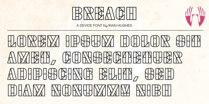 |
| Download Breach Fonts Family From Device |
|
Beach is a geometric stencil font in two variants. Powerful, futuristic and unique.
|
| Download Breach Fonts Family From Device |
 |
Inlow is a font that evokes a sense of retromodernity, aesthetics, and something perfect. When developing it, I wanted to convey a touch of retro design and modern design. It can be used in the design of posters, logos, covers, Instagram, just in the text and many other ideas, all just border on your ideas. I think I can see this font on the covers of books. It's exciting.
Inspirations were book covers and cars from the 60s and 80s. I wanted to convey retro and modernism.
The use of the font is unlimited, and the support of many European languages and not only gives a huge scope for creativity!
Design By Eugene Bunin.
 |
CAPITALIZED, geometric, bold and round.
If the typographer sees a font like that, it's enough to make his toes curl. But sometimes it just has to be that way.
Geometrically constructed fonts do not necessarily have to be pointed and angular; It also works consistently around. And if I say it consistently, then in this case, that's done consistently.
The basis for the BOULE is the circle. The letters are drawn with constant line width, the “corners“ and endings all have the same radius, the lines are all the same thickness.
The BOULE consists only of capitals. There is only one difference in the use of uppercase and lowercase letters: in the uppercase letters, the round letters are circular, while the lowercase letters are narrow.
The character set of the Boule contains all letters and accents to support the Western, Northern, Central and Eastern European languages with Latin alphabet.
The BOULE is not only very fat, it also runs very tight; that is, the glyphs are very close to each other. To avoid "holes" due to unfortunate letter combinations, the BOULE contains ligatures for FT, ST, TT and TZ.
There are also other versions of the font: BOULE Brillant on the one hand. In this version, simple highlights simulate a light incidence from the top right. These light edges give the font a decorative effect that makes it easy to think of wet sausages or balloons in some shapes.
And finally the BOULE Contour. As the name implies, it is the outer contour of the letters, combined with a shadow at the bottom left.
The name BOULE (French for ball) says it already: this font is globated. Therefore, it is also very suitable for all three-dimensional alienation effects. With simple light and shadow you can achieve a very convincing 3D effect with little effort.
 |
FS Rome is a beautiful classic Roman caps font, based on Trajans column lettering


Nema is a sans serif family built in calligraphic structure. It consists of 14 styles including 7 weights and italics. Even if the character structure is constructed in classical geometric proportions, some letters were treated flexibly.
 |
 |
 |
 |


